
at a glance
Problem
At my firm, teams rebuilt the same UI over and over with no shared standard, and AI-assisted coding made screens drift even further.
My role
Sole designer and engineer: design tokens, components, documentation, tests and CI.
Key decisions
Three-layer tokens, native HTML first, and a contrast check that fails the build.
Outcome
8 accessible components, 4 product screens, 68 tests, and a live Storybook.
overview
A React design system that developers, designers and AI agents can all build from
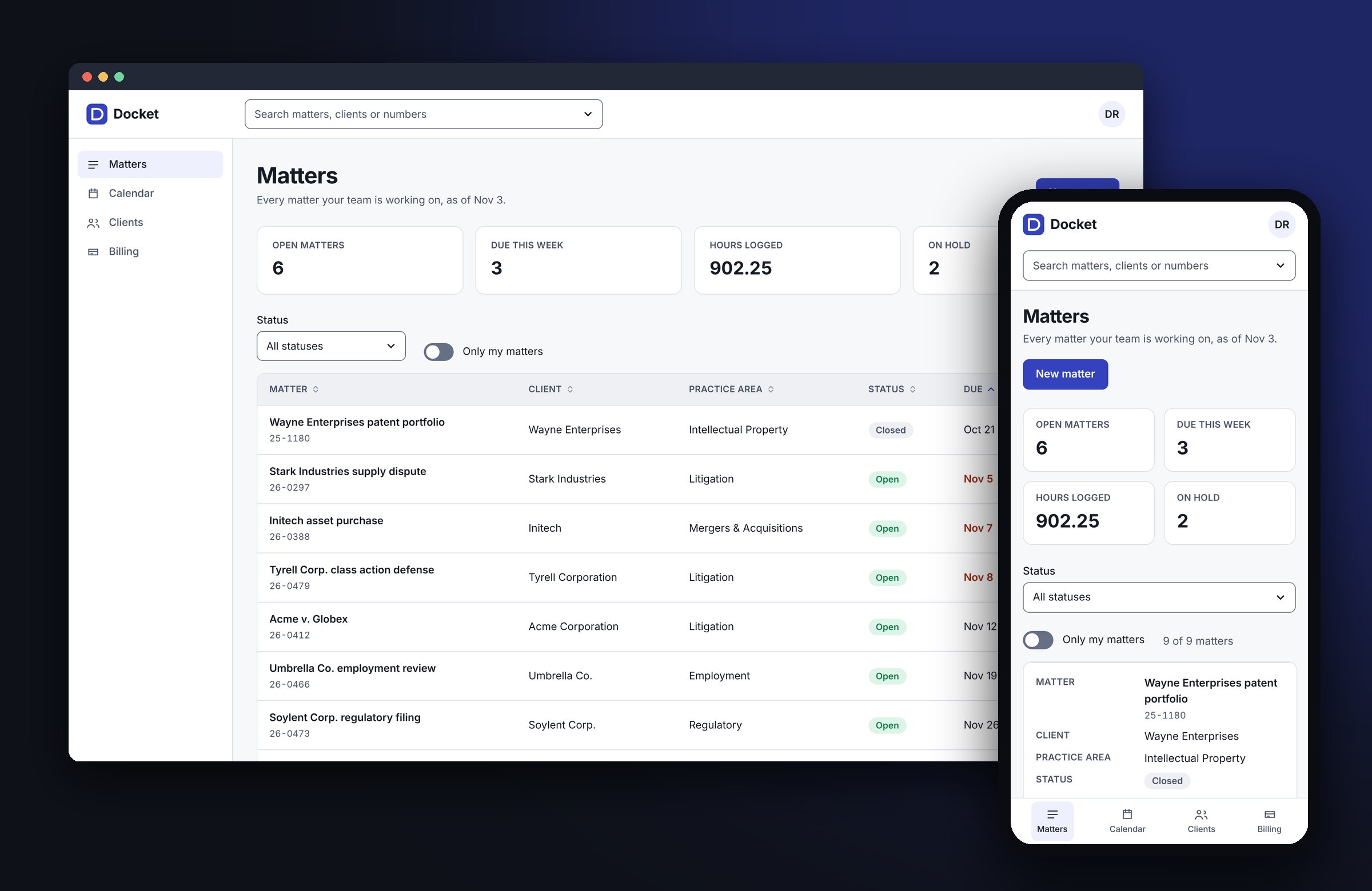
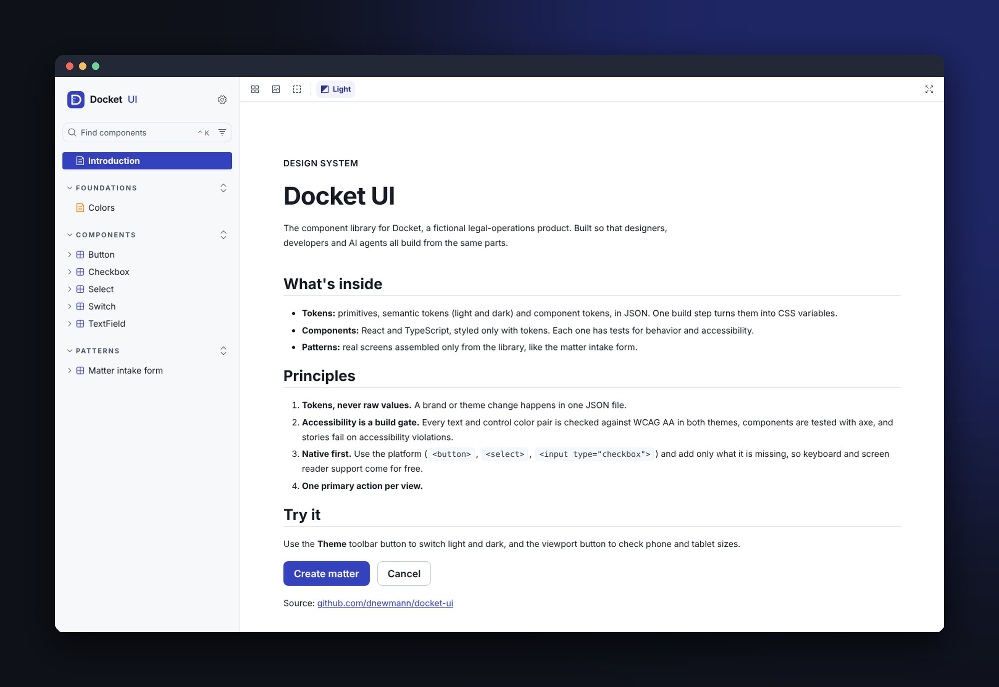
Docket UI is a React and TypeScript component library for Docket, a fictional legal-operations product. Design tokens drive every component, Storybook documents them, and accessibility is enforced by the build. A full Matters dashboard, built only from the library, shows it working as a real product screen.
About this project
This work comes from my current role, where I built the design system for a global law firm's internal applications. That system, its screens and its data are confidential, so they can't be shown here. Docket UI is a working example of the same approach: same architecture, same workflow, original brand and sample data.
Role
Design engineer: repo setup, design standards and visual language, component APIs, accessibility bar, direction and review of an AI-assisted build
Stack
React 19 • TypeScript • Vite • CSS Modules • Storybook • Vitest + React Testing Library + axe • GitHub Actions • Netlify
Explore it
Skills shown: component-driven development • design tokens • Figma-to-code • WCAG 2.1 AA and ARIA patterns • responsive design and container queries • unit, integration and accessibility testing • CI/CD • AI-assisted development • stakeholder buy-in and adoption planning
problem
Every internal app rebuilt the same buttons, forms and tables
At the firm, front ends were built with Telerik defaults or however the developer on the project chose. There was no shared standard, so the same components were rebuilt over and over, and older apps were never revisited to pick up style changes. Each project drifted further from the last.
AI coding tools made it worse. Several developers prompting their own assistants produced several different versions of the same screen.
Core challenge
Give people and AI the same source of truth: one set of tokens and components, linked to the Figma library through Code Connect, so a design turns into the same code no matter who, or what, writes it.
What I owned
As the sole designer, working with engineers, project managers and stakeholders, I audited and rebuilt the Figma library, set the standards, built the code library, and pitched it to leadership with a live demo and an adoption plan: a pilot team, hosting, and a named owner.
approach
Tokens first, native elements, quality as a build gate
What I built
• Three-layer design tokens: primitives, semantic tokens with
light and dark values, and component tokens, in JSON. A build script generates
CSS variables and fails on broken references or themes that drift apart.
• 8 components: Button, TextField, Select, Checkbox, Switch,
plus the three that test a design system most: an accessible Modal, an async
Combobox, and a sortable, responsive Table.
• 4 product screens: a matter intake form; a Matters dashboard
with search, filters, a data table and a create flow; desk booking with a
floor plan and guided tour; and an AI assistant with saved chats and prompts.
• Documentation: a branded Storybook with usage guidance,
live controls, and a colors page generated from the token files.
• CI/CD: every pull request runs the contrast check, lint,
type checks, 68 tests, the library build and the Storybook build, and gets a
preview deploy.
Principles
• Tokens, never raw values
• Accessibility enforced by the build
• Native elements first
• One primary action per view
key decisions
Four decisions, and what each one cost
Theming that actually cascades
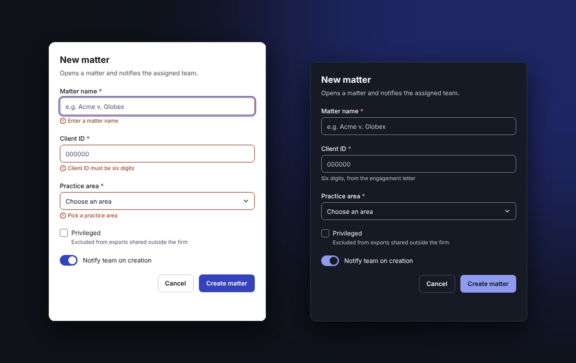
Component tokens reference semantic ones. Declared only on the page root, they resolve once and stay light inside a dark section. I re-declare them on every themed element so any part of a page can switch themes. Trade-off: a slightly larger stylesheet for correct nesting.
Input borders that pass WCAG
The usual light-gray border sits near 1.5:1 against white, below the 3:1 WCAG 2.1 requires for form controls. A dedicated input border token brings it to 4.97:1 in light and 5.92:1 in dark, and the build checks it. Trade-off: heavier-looking fields, chosen on purpose.
Native elements first
Modal is built on the browser's own dialog element, which keeps the page behind it inert. Select is a styled native select. Keyboard, screen reader and mobile support come from the platform; I add only what's missing, like returning focus to the button that opened the dialog. Trade-off: less styling control in exchange for fewer bugs.
A table that adapts to its space
The Table uses a container query, not a screen-size query, so it turns into labelled cards whenever its own space is narrow: on a phone, or in a side panel on a desktop. Explicit roles keep it readable to screen readers in both layouts. Trade-off: needs current browsers.
workflow
AI-assisted, verified by the build
At the firm, I set up the repository, defined the design standards and the visual language, then directed AI tools to implement against them and reviewed every change. Docket UI uses the same workflow in public: I set the scope and the quality bar, Claude Code implements, I review, and the build verifies. Every change has to pass the contrast gate, types, tests and both builds before it merges.
What the gates caught
On its first run the contrast check failed four status color pairs, and the input border failed the 3:1 rule. Both were fixed in the tokens before anything shipped, not found later in an audit.
Why it matters
AI writes code quickly. The hard part is knowing what correct looks like and proving it. Clear specs, code review and automated checks are how I keep the speed without lowering the bar.
outcome
Live, tested, and open to inspect
Shipped
8 components, 4 product screens, light and dark themes, 3 breakpoints, and a branded Storybook live on Netlify
Verified
68 unit, integration and accessibility tests; a WCAG contrast gate over every color pair in both themes; CI on every pull request
Next
An AI layer that lets agents build pages from these components, with evaluations that check the output uses real components and passes accessibility checks
reflection
A design system is a set of decisions you can check
A style guide asks people to remember the rules. A design system with tokens and automated checks makes the rules executable. That shift, from documentation to checks, is what lets a team, or one engineer working with AI tools, move fast without the UI drifting.