
overview
Turning a low-adoption seat booking tool into a daily workflow
This project is an internal hoteling platform for a large global law firm. I led UX direction (user flows, information architecture, MVP scope) and implemented core UI components on web; later I drove a mobile redesign focused on usability and maintainability.
I focused on overall UX direction and sequencing—challenging requirements, questioning assumptions, and shaping solutions that balanced user needs, technical feasibility, and organizational constraints. In a stakeholder-driven environment, I also advocated for a design sign-off gate before front-end build to reduce churn and rework.
Role
UX programmer • product UX direction + front-end implementation
Platforms
Web (ASP.NET Core MVC) • Mobile (.NET MAUI) • Telerik UI
Impact
Adoption grew to ~90% (department-reported); reduced need for training on core booking flow
problem
The tool created friction, confusion, and scope creep
The original experience was a simple “map + dropdown” with limited booking rules and high user friction (small map, hard-to-scan availability, next-day booking only). Feedback was driven primarily by seniority rather than usage data, which inflated complexity and encouraged building features without validating whether they improved daily workflows.
Key UX failure modes
Navigation noise: The UI exposed access-gated pages to all users
(e.g., “Share Your Office”), creating dead-ends that punished exploration and reduced confidence.
Feedback loops: Requests from senior stakeholders often expanded scope
without clear evidence of benefit, increasing content density and distracting from the primary job-to-be-done: booking a seat quickly.
With limited analytics, I relied on informal user feedback, support signals, and later mobile visitation data to confirm that many access-gated or “nice-to-have” features were rarely used—reinforcing the need for role-based visibility and tighter prioritization.
solution
MVP-first UX, cleaner information architecture, and reusable UI foundations
Contributions
• Established an MVP UX baseline (flows + IA) before front-end build to prevent thrash and downstream rework
• Improved booking clarity: more scannable availability cues, seat details, and a calendar-based path to book in advance
• Reduced dead-ends with role-based visibility (e.g., hiding “Share Your Office” unless the user had access)
• Added admin tooling that reduced manual effort for office operations (managing maps/seats and reporting)
From an engineering perspective, I focused on reducing UI coupling and duplication by introducing reusable components and shared styling patterns on web. On mobile, I led a redesign and helped refactor front-end structure to improve state management, reduce tight coupling, and make UI patterns portable across screens for faster iteration.
Constraints
• Limited analytics tooling and formal research budget
• High security and approval friction
• Senior leadership sign-off culture
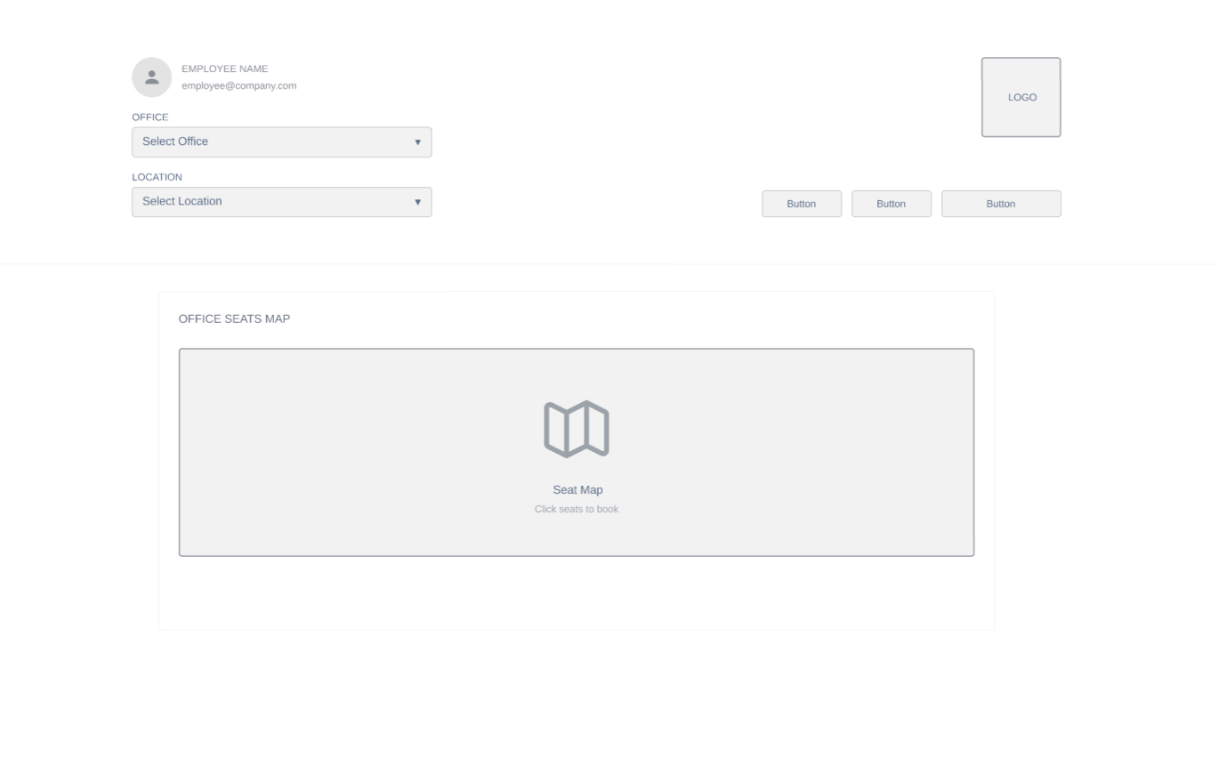
Before
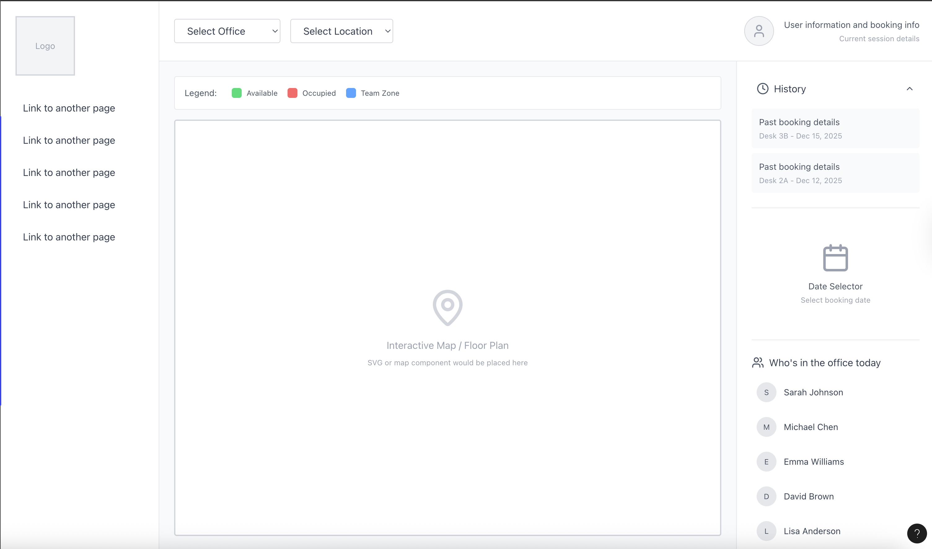
After
evidence
Outcome: adoption and usability gains, even with imperfect data
Formal UX analytics were limited, so I triangulated impact through informal user interviews, support tickets, leadership readouts, and selective mobile usage signals—focusing on whether users could complete the core booking flow quickly without training.
Adoption
Usage increased to approximately 90%, as reported during department-wide all-hands, and the core booking flow required little to no formal training compared to other internal tools.
Mobile redesign
The redesigned mobile experience was praised for clarity and ease of booking, alongside a cleaner engineering foundation focused on reusability and maintainability.
private details
Want the full enterprise version?
Due to client confidentiality, detailed visuals, internal workflows, and implementation specifics (IA artifacts, abstracted flows, and code-level notes) are available in a private packet upon request.